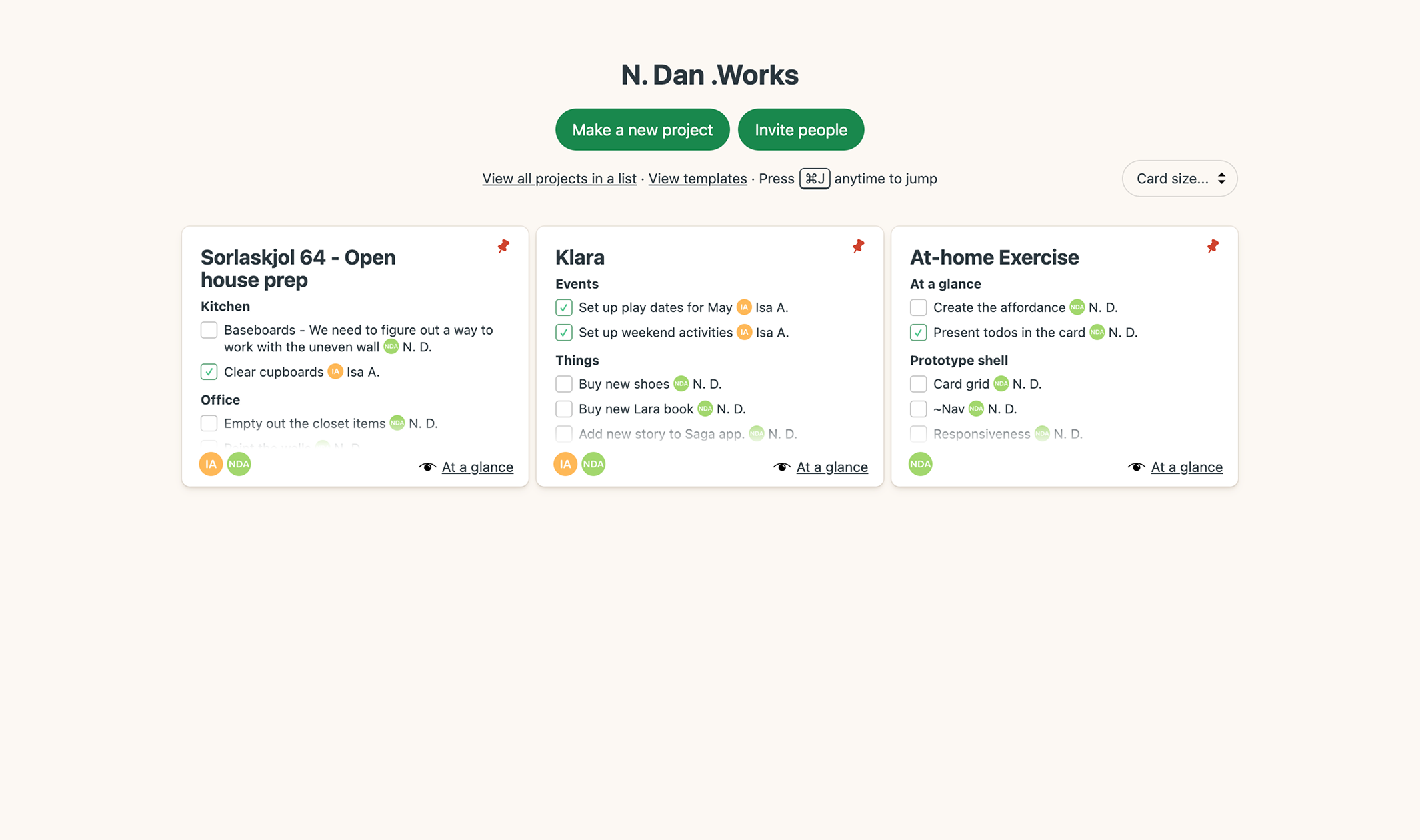
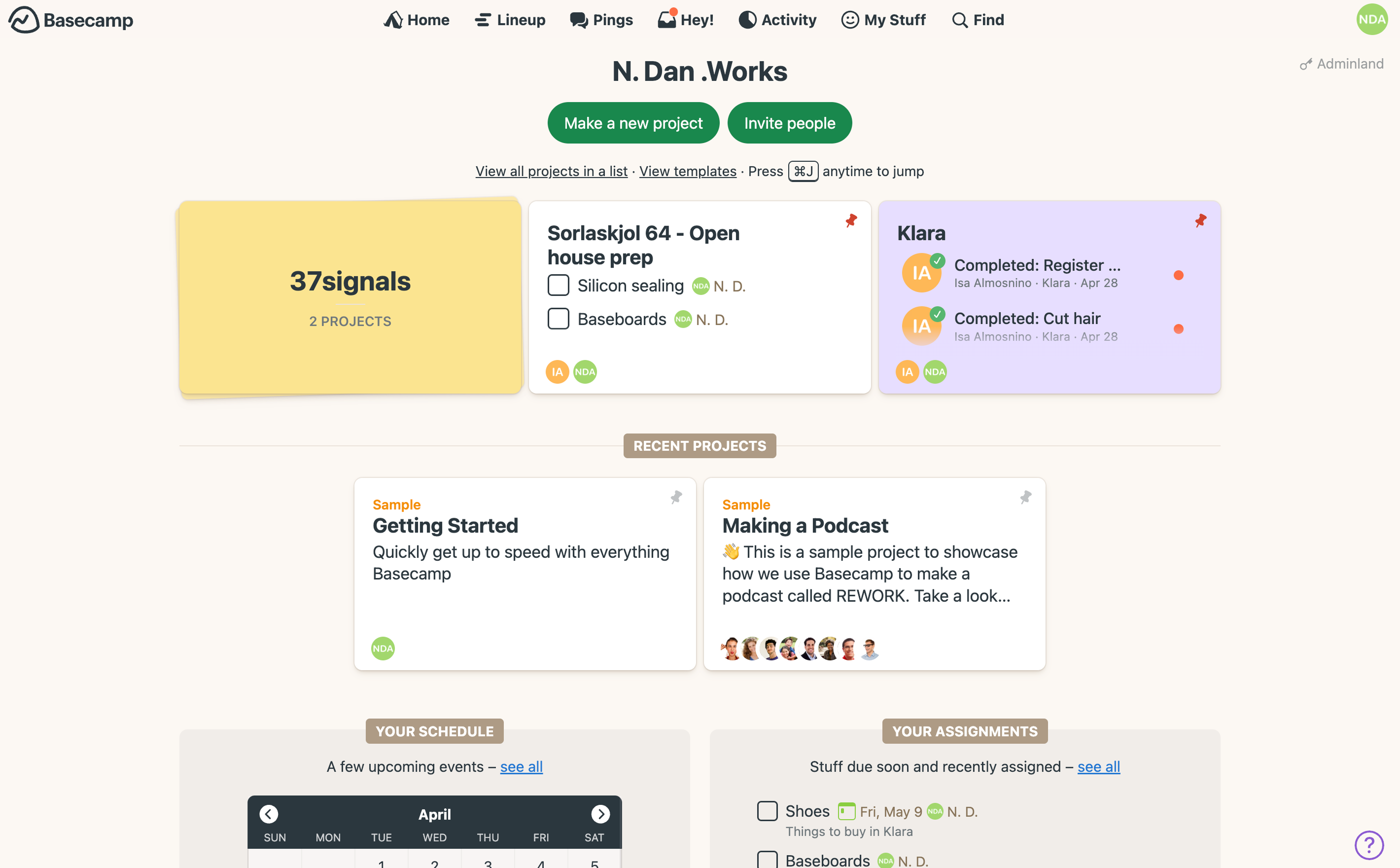
Basecamp - At a glance
Make Basecamp's Home screen more dynamic.
What's been happening? What’s next? Those are the two questions I have when I open Basecamp. Today's Home screen doesn't answer them right away. I click into projects. Scan the Activity page. What if the answers were right there, on the cards, at a glance?
Why not a full redesign? Basecamp's Home is warm. Inviting. Most other products feel like data-tables on steroids. Cold and sterile. That's not Basecamp. I didn't want to lose that.
So I focused on the cards. What if they were just a little more dynamic? Helpful, not busy. Enough to answer those two questions. Customizable, with a click.
Whether you're working on one project or many, I think you're going to like it.
— N. Dan Alm
Project Activity
-
Saturday, May 3
What did you work on today?
- Final day of the cycle! It's been fun to work on this project. I'm happy with the result!
- Today was all about polish. Design details, small code refactoring, testing. And working on the final touches. I've published the prototype to the web, grabbed the URL for the repo, and now adding my final update on this change log! I also created a quick video of the prototype in action, as you saw above.
- Thanks for taking the time to review the work. I look forward to hearing from you!
-
Friday, May 2
What did you work on today?
- I had a productive day. I took a day off from Automattic to focus on the prototype.
-
I had a great chat with Isa about the main affordance of the feature itself.
Check out the comment in the Basecamp doc, to see how I evolved the design over the course of the day.
- After refining the affordance, I pushed on refining a few sections in the card. Leaning towards the preview style of content, like the cards in a project's main page. I talked with Isa and we thought I could further refine the updates in the cards with language and copy. For example, instead of showing the checkbox checked, it could say "Isa completed [task name]." Time permitting, I'll tackle that tomorrow as a "Nice to have".
- I also did a quick hook up with JS (and Cursor), so that it saves the card states and preferences in local storage, to get a better feel what it would be like coming back to the Home screen and seeing the projects at a glance.
-
Thursday, May 1
What did you work on today?
- Made focused progress on the prototype. Hooked up the “At a glance” knob on the card and built out the todo list preview. Sketched the remaining knob states for the other views.
- Playing with the live knob sparked a new idea: Let users control the card size — not just 16:9, but different levels of density. Mocked it up in code. I'll refine the menu tomorrow.
- Realized I could’ve just turned on Automatic Check-ins in the Basecamp project 🙈 — instead of building this log from scratch. No worries. Glad I’ve been journaling along the way.
-
Wednesday, April 30
What did you work on today?
-
Recorded a quick video of the “At a glance” cards in action. Stitched it together
using the Inspector and a quick Figma prototype. I’m liking the knob concept—like
tuning into your favorite station. Old-school, nostalgic, playful, and fun.
- Made solid progress on the prototype shell. Built the header, buttons, and first card. Tomorrow I’ll apply the grid layout, then dive into the knob and card content.
- Talked to Isa about the "At a glance" cards. We both agreed: we care more about "what happened" and "what's on deck" — than what we personally did. We already know that part.
What's going on outside of work? Anything fun?
- It’s Wednesday, which means a new episode of The Studio on Apple. I love this show — I laugh out loud every time.
- My daughter Klara (she’s two) loves playing soccer! Now I just need to help her stop missing the ball and wiping out!
-
Recorded a quick video of the “At a glance” cards in action. Stitched it together
using the Inspector and a quick Figma prototype. I’m liking the knob concept—like
tuning into your favorite station. Old-school, nostalgic, playful, and fun.
-
Tuesday, April 29
What did you work on today?
-
Started sketching the prototype concept for
"At a glance" cards
directly in the inspector. Feeling good about where it’s heading.
- Brushed up on Shape Up Part 3. Glad I did — I deprecated the "Design and Development" list and replaced it with "Unscoped," which turned into two scoped lists so far ("At a glance cards" and "Prototype shell").
- Also read Michelle’s post: HEY Bubble Up: From kickoff to launch. Appreciated all the details she shared about the process.
-
Started sketching the prototype concept for
"At a glance" cards
directly in the inspector. Feeling good about where it’s heading.
-
Monday, April 28
What did you work on today?
- Moved the Basecamp project into a separate project for the exercise. Following 37signals' Guide to Internal Communication.
- Upgraded my Basecamp account to support multiple projects. Invited my wife, Isa, to collaborate on home projects and observed how updates and assignments show up for each person.
- Initialized the project repo, published it, and set up a subdomain: basecamp-home.ndan.works. Every commit to `main` auto-deploys.
- Started adding basic styles — mostly variables — to the repo. Pulled a few values directly from Basecamp’s production code using the inspector.
- Jotted down more rough ideas and notes in the Idea doc.
What will you be working on this week?
- This week I’m tackling the at-home exercise. Evolving the Basecamp home screen from a static project launcher into something more dynamic. Answering: “What’s been happening across my projects?”, "What's on deck?" The goal: work for both cases—one project or many happening at once.
-
Sunday, April 27
What did you work on today?
- Prepped the Basecamp project. Set up todos around logistics, created a temp changelog doc, and imported the brief as a document.
- Started framing the problem. What questions should this solution answer? Began jotting down rough ideas in a doc, which I’ll expand and refine as the week goes on.